Panoramic Split-Frame App Store Screenshots vs Standalone Single-Panel Cards
Panoramic split-frame screenshots — where one giant angled device bridges the gap between slide one and slide two — look striking on a desktop Behance portfolio, yet often backfire in real iOS App Store search results, localization, and A/B tests. Standalone single-panel 3D cards keep every frame self-contained, readable in search thumbnails, and effortless to adapt across 13-inch iPad and foreign languages.
1. How App Store search gaps break split-device panoramas
In iOS App Store search results, Apple inserts visible rounded corners and whitespace gaps between your first three portrait screenshots. When you slice a phone screen or headline across slide one and slide two, that whitespace chops your UI right down the middle — leaving neither thumbnail showing a complete, readable screen.
Standalone single-panel cards place one crisp RealityKit 3D device and one complete 4-to-7-word headline inside each frame, turning the three-up search row into three distinct, instantly legible reasons to tap Get.
| Store context | Panoramic Split-Frame Layout | Standalone Single-Panel 3D Cards |
|---|---|---|
| iOS search results (3-up portrait) | Gap & rounded corners slice device/UI in half | Each of the 3 visible frames reads cleanly on its own |
| Product page horizontal scroll | Seamless only while user holds scroll mid-swipe | Every snap point frames a complete benefit + UI |
| App Review Guideline 2.3.3 clarity | Riskier if slide 1 shows mostly empty art + half bezel | Clear shipping in-app UI visible inside every slot |
| Harmonious multi-slide flow | High visual continuity | Achieved cleanly via unified background gradients |
2. Why split seams multiply localization and iPad headaches
The hidden tax of split-frame panoramas hits when you adapt from 9:19.5 iPhone to 3:4 13-inch iPad or translate into German and Japanese: changing aspect ratio shifts edge geometry so halves stop lining up, and reordering slide two with slide three during an optimization test ruins the artwork.
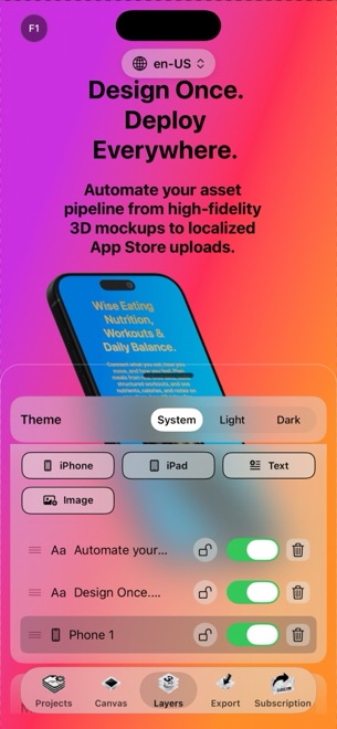
With standalone 3D cards in StoreFront Studio, one master canvas adapts smoothly across 6.9-inch iPhone, 6.5-inch iPhone, and 13-inch iPad, and you can update or reorder individual slides across twenty languages without redrawing adjacent slots.
| Maintenance task | Panoramic Split-Frame | Standalone Cards in StoreFront Studio |
|---|---|---|
| Adapting phone layout to 13" iPad | Seam angles misalign on wider 3:4 aspect ratio | One canvas adapts cleanly per device family |
| Swapping slide 2 and slide 3 order | Impossible without repainting split bridge | Independent slides reorder or update anytime |
| Translating into 10+ languages | Cross-slide headlines break on word-order changes | Each slide’s headline wraps cleanly inside its own margin |
| Updating 1 outdated UI screen in v1.2 | Must re-slice and re-export paired neighbors | Swap texture on that single 3D model & push via API |
3. Getting cohesive multi-slide energy without split-screen fragility
You do not need sliced half-phones to make a storefront feel cohesive. Pairing consistent multi-stop linear or radial background palettes with a subtle 3D hero angle on slide one and crisp front-facing RealityKit 3D models on slides two and three gives your search listing unified brand polish while keeping 100% UI legibility.
Add a single per-word gradient highlight on each slide’s focal verb so shoppers scanning left to right grasp three distinct outcomes in two seconds.
| Goal | Recommended layout | Why |
|---|---|---|
| Maximizing search tap-through & clarity | Standalone 3D cards with unified palette | Every thumbnail communicates a complete feature & UI |
| Fast multi-size iPad + 15-locale releases | Standalone 3D cards in StoreFront Studio | Zero cross-slide seam alignment bugs |
| Single-locale lifestyle brand experiment | Subtle background color flow only (keep UI whole) | Preserves visual continuity without cutting UI in half |
Do panoramic split screenshots still convert better on the App Store?
Split backgrounds look flashy in design portfolios, but slicing the actual app UI across two slots hurts readability in 3-up iPhone search results where whitespace separates each card.
Can App Review reject a split screenshot?
If slide one ends up showing mostly background graphics and only a sliver of clipped bezel rather than the app clearly in use, reviewers can cite Guideline 2.3.3.
How do I make standalone slides feel connected in StoreFront Studio?
Use a shared font scale, complementary linear or radial background gradients, consistent 3D studio lighting, and one accent gradient style across all slides.
Why are standalone cards easier for Custom Product Pages and PPO?
Because each slide is self-contained, you can promote slide four into slot one for a targeted audience without breaking cross-slide seams.