Adapting iPhone Screenshot Layouts for 13" iPad
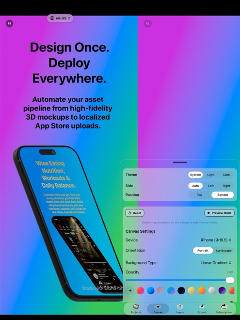
If your Xcode target compiles for both iPhone and iPad, App Store Connect requires 13-inch iPad screenshots before you can submit. Pasting tall iPhone screenshots onto an iPad background — or stretching phone UI inside a tablet bezel — routinely triggers metadata rejections. StoreFront Studio lets one project adapt cleanly to 13-inch iPad proportions with authentic 3D iPad hardware.
Why stretched phone captures get rejected on iPad slots
Under App Store Review Guideline 2.3.3, screenshots must show your app running natively on the corresponding device family. Reviewers quickly spot bottom tab bars stretched across 2064 pixels, iPhone Dynamic Island cutouts inside an iPad frame, or letterboxed compatibility windows.
Always boot an iPad Pro (13-inch) simulator or real iPad to take genuine iPadOS captures showing split views, sidebars, or multi-column grids where your app uses them.
- Capture true iPadOS screens (2064 x 2752 px or 2048 x 2732 px portrait, or landscape equivalents).
- Use an authentic 3D iPad hardware model rather than scaling up an iPhone bezel.
- Decide whether portrait or landscape better showcases multi-column iPad layouts.
Adjust composition for the wider 3:4 tablet canvas
An iPhone screen has a tall vertical silhouette that leaves natural space above and below. A 13-inch iPad canvas is nearly three-quarters as wide as it is tall, meaning a full-height tablet mockup plus a three-line headline will collide unless you adjust scale or placement.
Cropping the bottom fifth of the 3D iPad cleanly off the lower canvas edge — or angling the tablet slightly in 3D space — preserves generous breathing room for a crisp two-line headline on top.
- Build and approve your iPhone screenshot sequence first so headlines, colors, and gradients stay unified across platforms.
- Capture matching scenes from your running iPadOS build using the same sample project or demo data.
- Switch to the 13-inch iPad dimension in StoreFront Studio, swap the screen texture onto a RealityKit 3D iPad model, and review the adapted layout.
- Verify that headline line breaks and 3D device scale leave comfortable margins on all four sides before exporting.
Choose portrait vs. landscape deliberately for iPad
Productivity, video, and canvas apps often shine in landscape on iPad because sidebars and toolbars sit open simultaneously. If you choose landscape iPad screenshots (2752 x 2064 px), placing the headline to the left of an angled 3D iPad — or in a compact single line above — prevents vertical crowding.
Keep orientation consistent across the first few iPad slots so the App Store gallery scrolls smoothly on iPadOS.
Push both iPhone and iPad sets in a single upload
When iPhone and iPad layouts share one project and localization table, fixing a headline phrasing updates your whole release rather than creating two drifting design files.
Once your 6.9-inch iPhone and 13-inch iPad sets pass visual review, StoreFront Studio uploads both device families across every localized storefront directly to App Store Connect.
Do I have to upload 13-inch iPad screenshots if my app supports iPad?
Yes. Any Universal iOS/iPadOS binary requires 13-inch iPad screenshots in App Store Connect before submission.
Can I place an iPhone mockup inside my 13-inch iPad screenshot canvas?
No. App Review rejects iPad screenshot slots that display iPhone hardware frames or phone-only UI layouts.
Does StoreFront Studio include real 3D iPad models as well as iPhones?
Yes. StoreFront Studio includes RealityKit-rendered 3D models for both iPhone and iPad generations.