App Store Screenshot Sizes and Dimensions Guide
Exporting the wrong pixel dimensions is the fastest way to stall an App Store release right before submission. Apple lets one primary iPhone display size and one primary iPad display size scale down automatically, while still supporting dedicated sets for older screens. StoreFront Studio adapts a single 3D layout across every required App Store Connect dimension so you review rather than redraw.
Start with Apple's primary iPhone and iPad display slots
App Store Connect allows up to ten screenshots per device family and locale. For modern submissions, uploading one flagship iPhone size and — if your app runs natively on iPadOS — one flagship iPad size covers the store's automatic scaling pipeline.
You only need separate custom exports for smaller display slots when an older aspect ratio crops critical UI or when you maintain legacy per-device sets.
- 6.9-inch iPhone (primary iPhone slot): 1320 x 2868 px or 1290 x 2796 px portrait (2868 x 1320 px or 2796 x 1290 px landscape).
- 6.5-inch iPhone (fallback when 6.9-inch is omitted): 1284 x 2778 px or 1242 x 2688 px portrait.
- 13-inch iPad Display (primary iPad slot): 2064 x 2752 px or 2048 x 2732 px portrait (2752 x 2064 px or 2732 x 2048 px landscape).
- File format rules: flattened PNG or JPEG in RGB color space with zero alpha transparency.
Watch how aspect ratios shift between phone and tablet
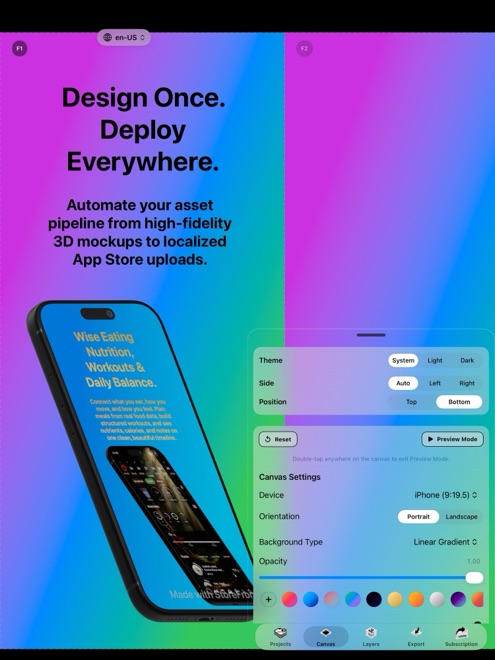
An iPhone portrait canvas is tall and narrow (roughly 9:19.5), leaving generous vertical breathing room above a 3D device frame for a two-line headline. An iPad portrait canvas is much wider (3:4), which squeezes top margins if you simply scale up a phone layout without checking.
Never stretch an iPhone capture into an iPad frame to satisfy a Universal binary requirement. App Review checks that iPad screenshots show genuine iPadOS interface layouts.
Adapt one master design across every required dimension
Rebuilding ten slides manually across three or four resolutions turns every copy edit into hours of repetitive file renaming. Designing on a responsive multi-size canvas keeps your typography styles, gradients, and 3D lighting unified.
In StoreFront Studio, you build the composition once and let the layout follow to 6.9-inch, 6.5-inch, 13-inch iPad, and older required dimensions automatically.
- Capture clean, high-resolution UI screens from your real iPhone and iPad builds or Xcode Simulator with a tidy status bar.
- Place the captures onto RealityKit 3D device frames on a single StoreFront Studio canvas and style your headline above each frame.
- Step through the target iPhone and iPad output sizes to verify line wraps, device scale, and edge margins.
- Export flattened, exact-pixel images or upload the entire multi-size set straight to App Store Connect.
Verify file hygiene before hitting Submit for Review
App Store Connect immediately rejects PNG files exported with an active alpha channel, even when every pixel looks visually opaque on your monitor. Make sure every background layer fills the canvas edge to edge with a solid color or gradient.
If you tested your layout on StoreFront Studio's free tier, remember that free exports include a small watermark after a rewarded ad. Upgrade to Pro before exporting final production assets so your store listing ships completely clean.
Decide between portrait and landscape slots early
Portrait screenshots let Apple display your first three frames side by side in iPhone search results, giving shoppers three visual hooks in a single glance. Landscape screenshots show only one wider frame in search results, which suits full-screen games or wide timeline editors better than standard vertical utilities.
Mixing orientations mid-set forces awkward scrolling on your product page, so lock a single orientation per device family before styling all ten slides.
How many screenshots can I upload per App Store locale?
App Store Connect accepts between one and ten screenshots for each required device display type in every localized storefront.
Why did App Store Connect reject my PNG for transparency?
Apple forbids alpha channels in screenshots; export flattened RGB PNG or JPEG files with a full-bleed background.
Does StoreFront Studio generate older App Store sizes too?
Yes. One canvas adapts across current 6.9-inch iPhone and 13-inch iPad dimensions as well as older required iPhone and iPad sizes.