Planning Your First Three App Store Screenshots
Most App Store visitors decide whether to keep scrolling before they ever open your full product page. In portrait orientation without an autoplay preview video, iOS search results display your first three screenshots right below your app icon and rating. Designing those three frames as one deliberate pitch matters far more than stuffing minor settings screens into slots eight, nine, and ten.
Treat the search result row as a single billboard
When someone searches for "budget tracker," "habit calendar," or "photo editor," four or five competing apps share the vertical scroll. Your first three portrait screenshots appear together at once, acting like a three-panel comic strip.
If frame one shows a login screen, frame two shows an onboarding permission prompt, and frame three finally reveals the actual workspace, shoppers have already tapped the app below yours.
- Slot 1 (The Core Job): Your clearest hero screen + primary outcome headline.
- Slot 2 (How Fast It Works): The signature interaction or time-saving workflow.
- Slot 3 (Why Trust or Choose It): Privacy, offline speed, 3D depth, charts, or export power.
Sequence all five to ten slots in order of buyer curiosity
Shoppers who swipe past slide three are interested enough to inspect details — secondary views, customization, widgets, or platform support. Use slots four through seven to answer practical "does it also support X?" questions.
You never have to fill all ten slots just because Apple allows ten. Five focused, high-contrast screenshots beat five strong slides followed by five repetitive settings menus.
- List the top five reasons real users keep your app installed after week one, ranked from broadest appeal to power-user detail.
- Capture realistic, populated in-app screens for each point — never empty zero-state screens or lorem ipsum placeholders.
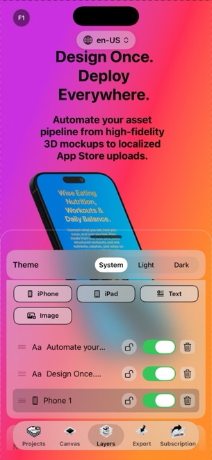
- Stage slot one with your strongest 3D hero angle and boldest per-word gradient headline in StoreFront Studio.
- Keep slots two and three front-facing enough that small search thumbnails clearly show real UI controls.
Populate sample screens with believable, clutter-free data
An empty chart or blank note list looks broken, while fifty tiny rows of test data look overwhelming. Populate your simulator or test device with clean, relatable sample entries that immediately reinforce the headline above the frame.
Check status bars and personal details carefully before capturing: full battery, clean time (such as 9:41), full Wi-Fi bars, and zero personal emails or notifications.
Iterate headlines without rebuilding your 3D stage
After launch, updating your first three headlines for a major feature release or seasonal Product Page Optimization test shouldn't require hiring an external designer. Keeping editable StoreFront Studio projects on your Mac, iPad, or iPhone lets you swap a screen capture or test a sharper headline in minutes.
Export the updated set — or push directly via the App Store Connect API — whenever a new release changes your core hook.
Why do portrait screenshots show three frames in App Store search?
On iPhone search results without a landscape screenshot or preview video in slot one, Apple renders the first three portrait screenshots side by side.
Should I show my sign-in or onboarding screen in slot one?
No. Always show your core in-app value in action immediately; sign-in screens fail to communicate what the app actually does.
Do I have to upload all ten screenshots to rank well?
No. Five to eight distinct, high-clarity slides convert better than padding your listing with redundant screens.