Dark Mode vs Light Mode App Store Screenshot Backgrounds: Contrast in Search Results
Roughly half of iPhone shoppers browse the App Store in iOS Light Appearance (pure white store page) and the other half in Dark Appearance (pure black store page) — meaning a pure white or pure black screenshot background loses its card edges for half your audience. Deep mid-dark gradients, rich brand hues, and studio-lit 3D RealityKit device borders in StoreFront Studio stay crisp against both store appearances.
1. How screenshot backgrounds behave in iOS Light vs Dark App Store UI
When a screenshot uses a `#FFFFFF` background without a border, its edges vanish into the Light Mode App Store feed; when a screenshot uses `#000000` with a dark bezel and no studio rim light, both the card and the phone frame vanish into the Dark Mode App Store feed.
Using multi-color linear or radial gradients — such as deep midnight navy/indigo for dark themes or warm tinted slate/pastel gradients for light themes — guarantees clean card boundaries in every user’s system setting.
| Screenshot backdrop choice | In iOS Light App Store | In iOS Dark App Store | 3D bezel visibility |
|---|---|---|---|
| Pure white (#FFFFFF) | Blends into page background | High contrast card pop | Dark titanium bezel stands out |
| Pure black (#000000) | High contrast card pop | Merges into black store canvas | Needs 3D studio rim light to separate |
| Deep rich gradient (navy, charcoal-indigo, emerald) | Crisp, premium card silhouette | Distinct from pure black feed | Excellent with RealityKit studio light |
| Tinted light gradient (soft sky, sand, lavender) | Subtle clean card edge | Bright readable card | Clean contrast with dark or silver frames |
2. Pairing dark vs light in-app UI with 3D materials and lighting
Matching dark-on-dark or light-on-light requires separating three layers: canvas backdrop, 3D hardware chassis, and in-app screen. In StoreFront Studio, toggling physically accurate RealityKit materials on and positioning a soft studio light puts a crisp metallic highlight along the iPhone or iPad edge so dark UI never muddies into a dark stage.
You can also add subtle borders and corner radii on callout layers, plus radial spotlight gradients behind the 3D device while keeping the top headline zone uniform for crisp typography.
| Your app’s primary UI | Recommended canvas backdrop | Headline & word-accent style |
|---|---|---|
| Dark-mode pro/media/dev tool | Deep navy/plum radial glow + lit 3D titanium frame | Pure white text + vibrant cyan/amber gradient focal word |
| Light-mode health/finance/notes app | Rich mid-tone brand gradient or tinted off-white | High-contrast white (on bold hue) or deep charcoal (on pastel) |
| Apps supporting both Light & Dark UI | Show primary theme slots 1–4; dedicate 1 slide to Dark/Light toggle | Keep one consistent backdrop family across the strip |
3. Auditing headline contrast at 110-pixel search width
Low-contrast pastel-on-cream or gray-on-charcoal headlines look refined on a 27-inch Mac monitor and turn completely invisible on a dimmed iPhone outdoors. Keep your main sentence near pure white or near black, and reserve multi-stop linear gradients for the single strongest verb or outcome word.
Because StoreFront Studio keeps gradients, lighting, and inline word colors live on one canvas, spinning up a dark-stage variant vs a light-stage variant for Apple Product Page Optimization takes minutes.
| Visual element | Common mistake | StoreFront Studio fix |
|---|---|---|
| 10-word rainbow gradient headline | Eye has no focal point; low end-stop contrast | 5–6 solid words + 1 high-contrast gradient payoff word |
| Dark bezel lost on dark background | Flat 2D black PNG merges into dark canvas | Enable RealityKit materials + top-left studio rim light |
| Busy gradient behind headline text | Bright color stop clashes with letters | Use radial gradient centered behind the 3D device instead |
Do dark or light App Store screenshots convert better overall?
Neither wins universally by category: productivity and finance often favor bright clean stages, while developer, cinema, audio, and night-use utilities thrive on lit dark stages. Test both free with Apple PPO.
Can I upload separate screenshots for iOS Light Mode and Dark Mode users?
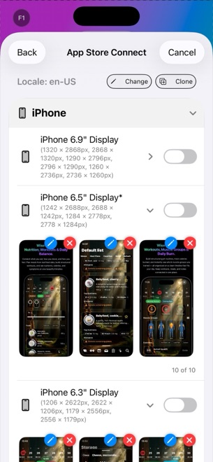
No. App Store Connect displays the same screenshot set regardless of the shopper’s system theme (unlike app icons in recent iOS versions), so choose mid-tone or gradient backdrops that frame well on both white and black.
How does StoreFront Studio keep dark screenshots from looking muddy?
RealityKit studio lighting and physically accurate 3D device materials create natural specular edge highlights, while radial backdrop glows separate the hardware from the canvas.
Can I style just one word with a bright gradient on a dark background?
Yes. StoreFront Studio’s text engine supports inline per-word colors and linear or radial gradients inside a single aligned sentence.