Apple 6.9-Inch iPhone & 13-Inch iPad Auto-Scaling vs Custom Legacy Screenshot Sizes
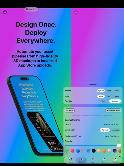
App Store Connect lets one primary 6.9-inch iPhone screenshot set and one primary 13-inch iPad screenshot set automatically scale down to smaller devices, saving most releases from uploading legacy sizes manually. Dedicated per-size exports still matter when aspect-ratio shifts (such as 16:9 older iPhones) or specific slot overrides demand exact framing — and StoreFront Studio adapts one canvas across both flagship and older required dimensions effortlessly.
1. Exact pixel dimensions for Apple’s primary iPhone and iPad slots
For modern iOS and iPadOS submissions, Apple centers screenshot requirements around the largest current display in each device family: 6.9-inch iPhone for phones, and 13-inch iPad Display for Universal or tablet apps.
Note that Apple NEVER auto-scales an iPhone screenshot set into an iPad slot (or vice versa): if your Xcode build targets both iPhone and iPad, uploading genuine iPadOS captures in an iPad frame on the 13-inch iPad dimension is mandatory.
| App Store Connect slot | Portrait pixel options | Landscape pixel options | Role in modern submissions |
|---|---|---|---|
| 6.9" iPhone Display | 1320 × 2868 or 1290 × 2796 | 2868 × 1320 or 2796 × 1290 | Primary iPhone base set (scales down to smaller iPhones) |
| 6.5" iPhone Display | 1284 × 2778 or 1242 × 2688 | 2778 × 1284 or 2688 × 1242 | Fallback base if 6.9" omitted, or optional custom override |
| 13" iPad Display | 2064 × 2752 or 2048 × 2732 | 2752 × 2064 or 2732 × 2048 | Primary mandatory iPad base set for Universal / iPad apps |
| Legacy smaller iPhone / iPad slots | Device-specific (e.g. 5.5" 1242 × 2208) | 2208 × 1242 etc. | Optional override when 9:16 vs 9:19.5 crop needs tuning |
2. Auto-scaling convenience vs multi-size canvas control
Relying on Apple’s automatic downscaling from 6.9-inch iPhone + 13-inch iPad keeps browser uploads tiny, yet you still face the hardest layout jump: moving from a tall narrow 9:19.5 iPhone canvas to a wide 3:4 iPad canvas without squashing your two-line headline into the top bezel.
And if you maintain an established app whose existing listing already holds custom overrides in 6.5-inch or 5.5-inch slots, updating only 6.9-inch while leaving stale screenshots in uninherited slots can show outdated UI on older phones. StoreFront Studio adapts one design across 6.9-inch, 6.5-inch, 13-inch iPad, and older required dimensions so every slot stays synchronized.
| Factor | Flagship 2-Size Base Only (6.9" + 13") | Full Multi-Size Set via StoreFront Studio |
|---|---|---|
| Minimum requirement for new Universal app | Fully satisfies App Store Connect rules | Fully satisfies + covers explicit legacy slots |
| Risk on apps with old 6.5"/5.5" overrides | Old unlinked slots may keep showing stale v1.0 UI | Updates every configured size simultaneously via API |
| 9:19.5 (iPhone) vs 9:16 (SE/5.5") fit | Apple letterboxes or scales automatically | Inspect exact margins per aspect ratio on canvas |
| Effort in StoreFront Studio | Review 2 sizes from 1 design & push via API | Review all sizes from 1 design & push via API |
3. Avoiding Guideline 2.3.3 rejections between iPhone and iPad
Whether you upload two display sizes or five, App Review enforces strict device honesty: never drop an iPhone screenshot or 3D iPhone bezel onto a 13-inch iPad canvas. Capture genuine iPadOS UI from an iPad or 13-inch iPad Pro Simulator and pair it with StoreFront Studio’s RealityKit 3D iPad hardware.
Every output exports as a flattened opaque RGB image with zero alpha transparency so App Store Connect accepts the entire upload on the first pass.
| Check | Pass rule | How StoreFront Studio helps |
|---|---|---|
| iPad slot hardware & UI | Real iPadOS UI inside 3D iPad frame | Includes dedicated RealityKit 3D iPad models & 13" sizing |
| PNG transparency / alpha | Zero alpha channel (100% opaque RGB) | Renders full-bleed opaque backgrounds automatically |
| Headline clearance on 3:4 iPad | No overlap between text and top bezel | Live size switcher lets you inspect and tweak tablet scale fast |
Can App Store Connect automatically generate 13-inch iPad screenshots from my 6.9-inch iPhone uploads?
No. Apple only scales within the same device family (phone to smaller phone, tablet to smaller tablet). Universal apps must upload separate 13-inch iPad screenshots.
Which pixel size should I pick for 6.9-inch iPhone?
Either 1320 × 2868 px or 1290 × 2796 px portrait (and their landscape equivalents) is accepted by App Store Connect for the 6.9-inch slot.
Does StoreFront Studio support older required sizes alongside 6.9-inch and 13-inch iPad?
Yes. One canvas adapts across current flagship dimensions as well as 6.5-inch and older required App Store dimensions.
How many screenshots can each size slot hold?
App Store Connect accepts from 1 to 10 screenshots per display size in each localized storefront.